

Airlines Branding
ABOUT THE PROJECT
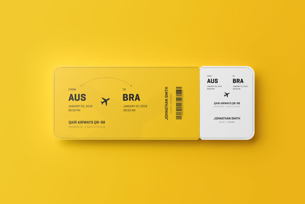
Aero - UI/UX and Branding Design Booking flights for a big Airlines Company. Most sites bombard a ton of info to users - relevant or otherwise. It includes various levels of intervention on the mark. Since the redesign of the logo through retail outlets, new graphics for its aircraft, redesigned tickets, signage standards to new standards of customer service. This project has been implemented in stages from 2018 to the present.
The formal features of identity are: the idea of the bird in flight and way of bolt, blue supported in warm colors, dynamic and free features, friendly according to the icon, which ultimately reinforce curves over straight lines typography. The proposal enhances the corporate values of safety, modernity and warmth.